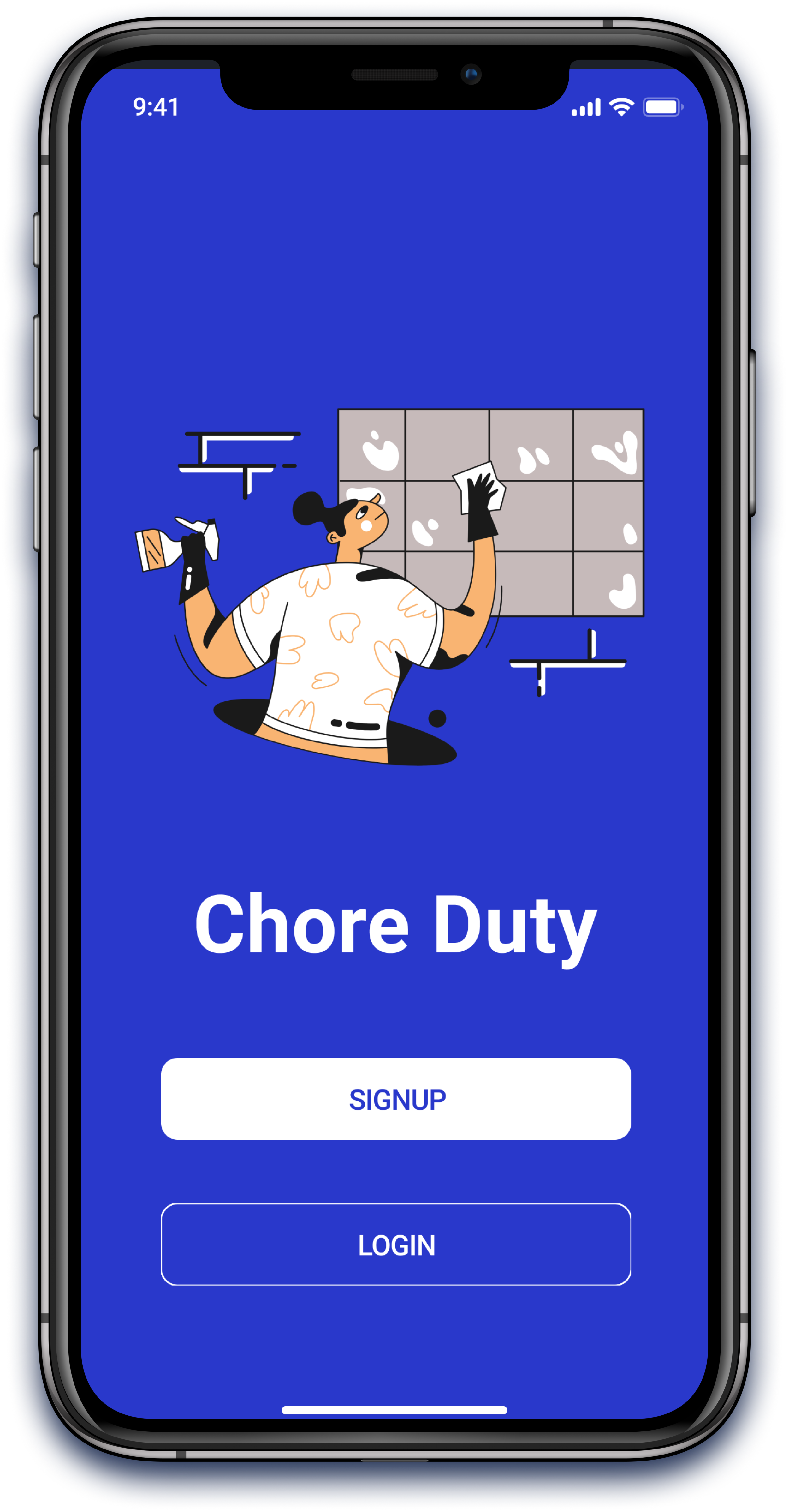
Concept App Design
Re-visualized task management application that distributes chores and keeps track of its completion.
Challenge: Prioritizing information, maintaining balance between design concept and it’s feasibility
About: This is a concept app design inspired from a problem which I was facing. Living in a shared apartment we often have issues with equal distribution of chores and keeping a track of who-did-what
Role: This being a solo project, I was responsible for research, design, branding and strategy
Methods used: Research, Affinity mapping, Prototyping, UI design, Usability Testing.
Tools used: Photoshop, Figma
Duration: 3 weeks
Problem Statement
How to divide chores and keep track of its completion? People sharing apartments with housemates often complain about incomplete house hold chores, leaving the place messy and untidy.
Let’s dive in and see how I reached here! Starting with my design process…
Understanding the problem space
Survey
The user group I decided to target was graduate and PhD students. I created a google form and reached out to participants who have similar housing conditions and share apartments. I got 20 responses to my survey, which I then grouped into categories for better classification.
After affinity mapping, the conclusions are:
No reliable channel by which roommates communicate. 42% people communicate orally, which people tend to forget. Other means are via text or clip board.
Need a constant remainder. 52% think that failure to remember is the main reasons chores are not completed.
People can not openly nudge their roommates to do the chores as it might affect their equation with them
Assimilating all the data and results, I decided to include the following modules:
Chore manager: to assign and build chore schedules.
Lists: to see all the different schedules built so far
Messaging feature: to discuss about chores, or which cleaning supplies are about to finish
Profile: to see users’ tasks
Settings: to manage notifications, personalize reminders, profile settings, log out
User Flow
I iterated this user flow process a couple of times while sketching low fidelity prototypes and dirty mock-ups.
Initial Sketches
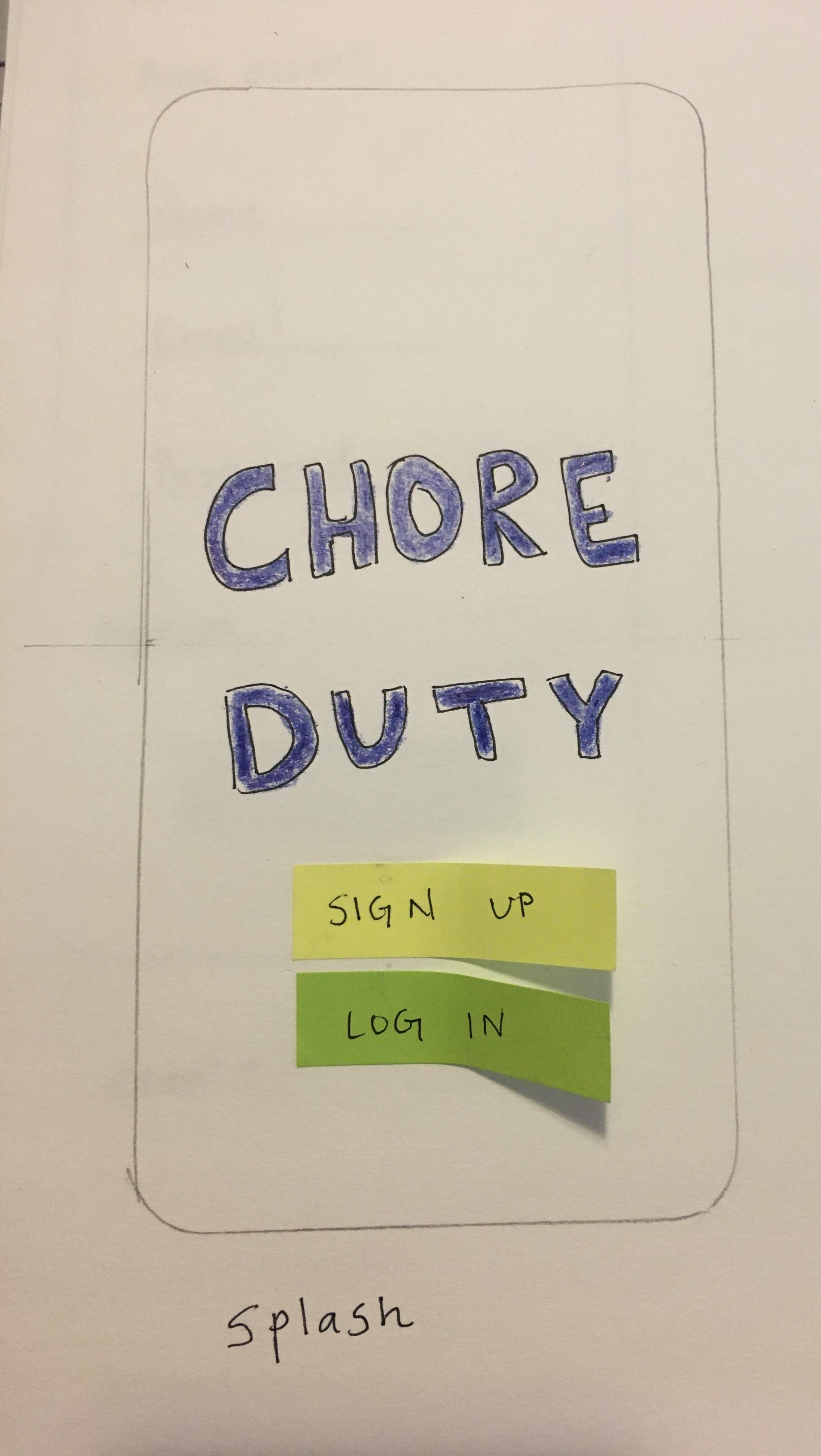
Splash screen
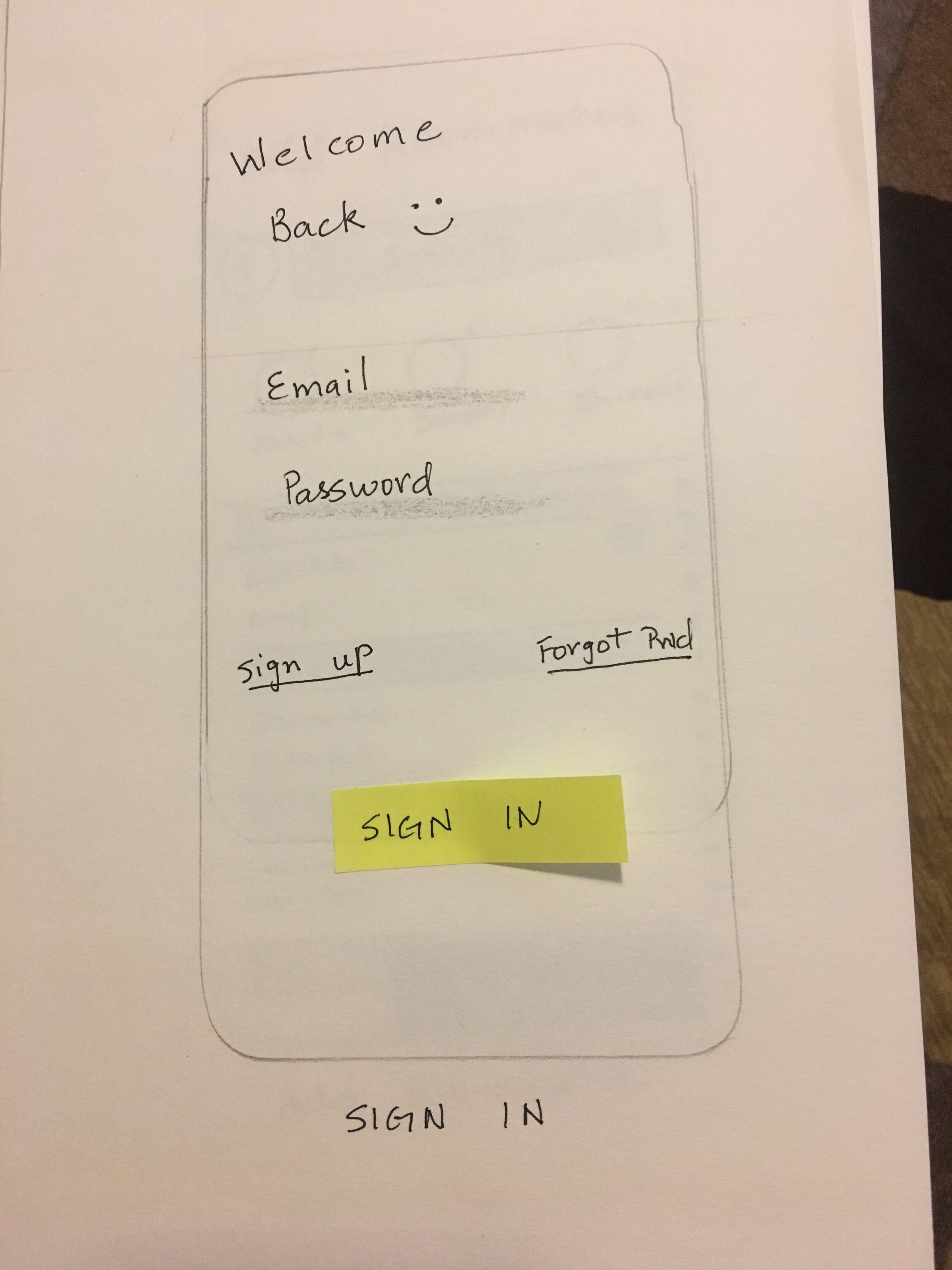
Login
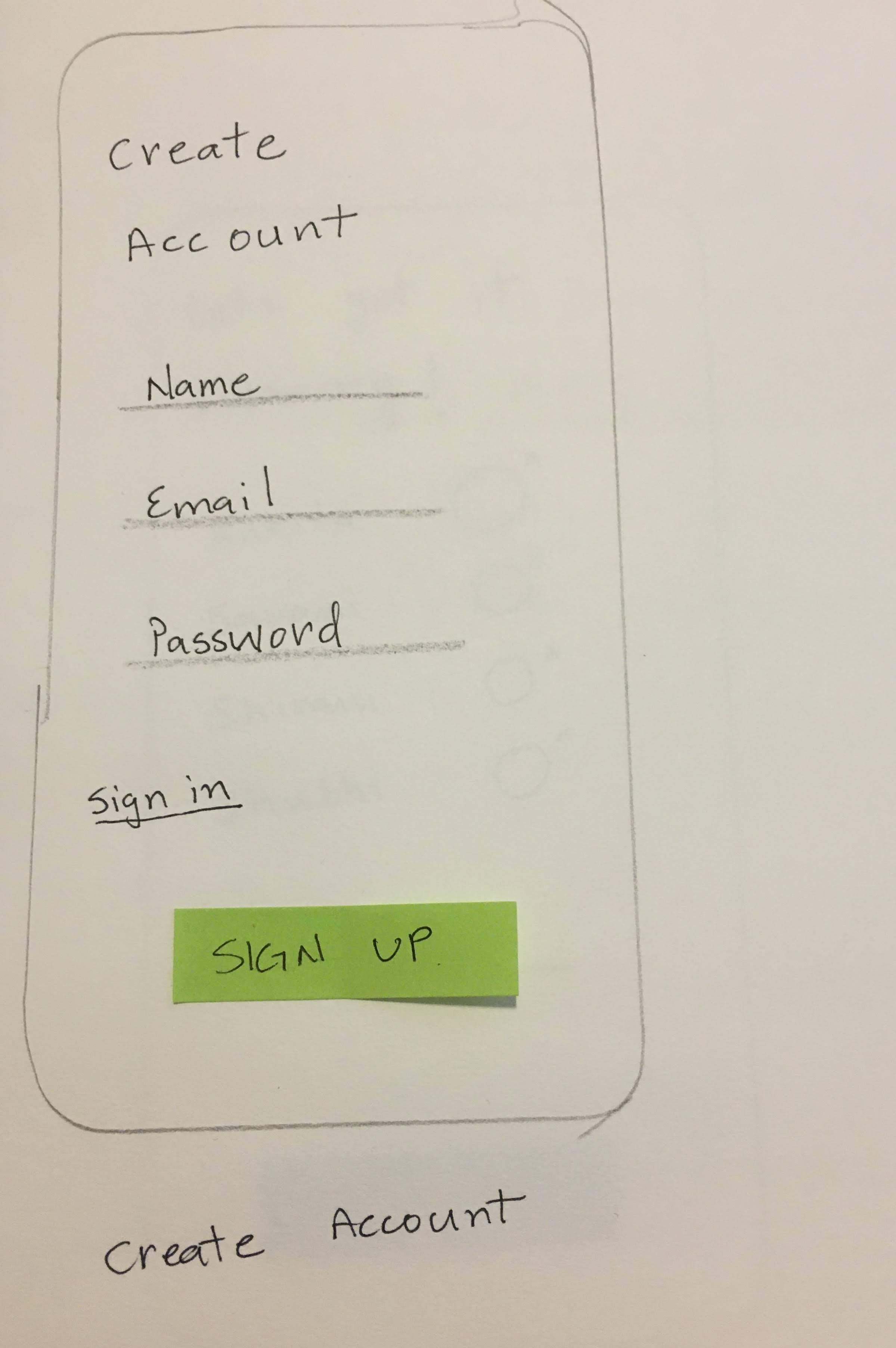
Sign up
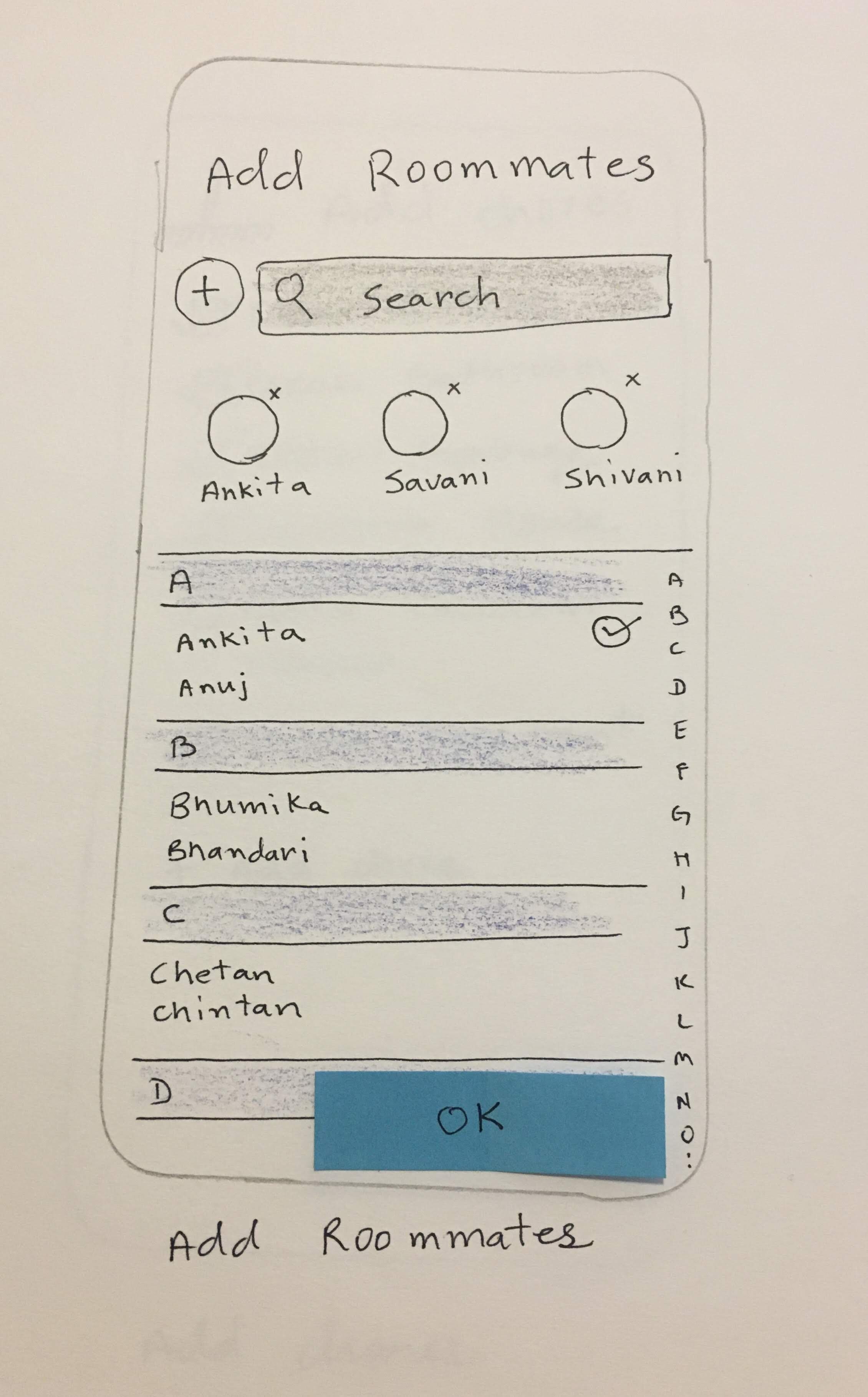
Add roomate
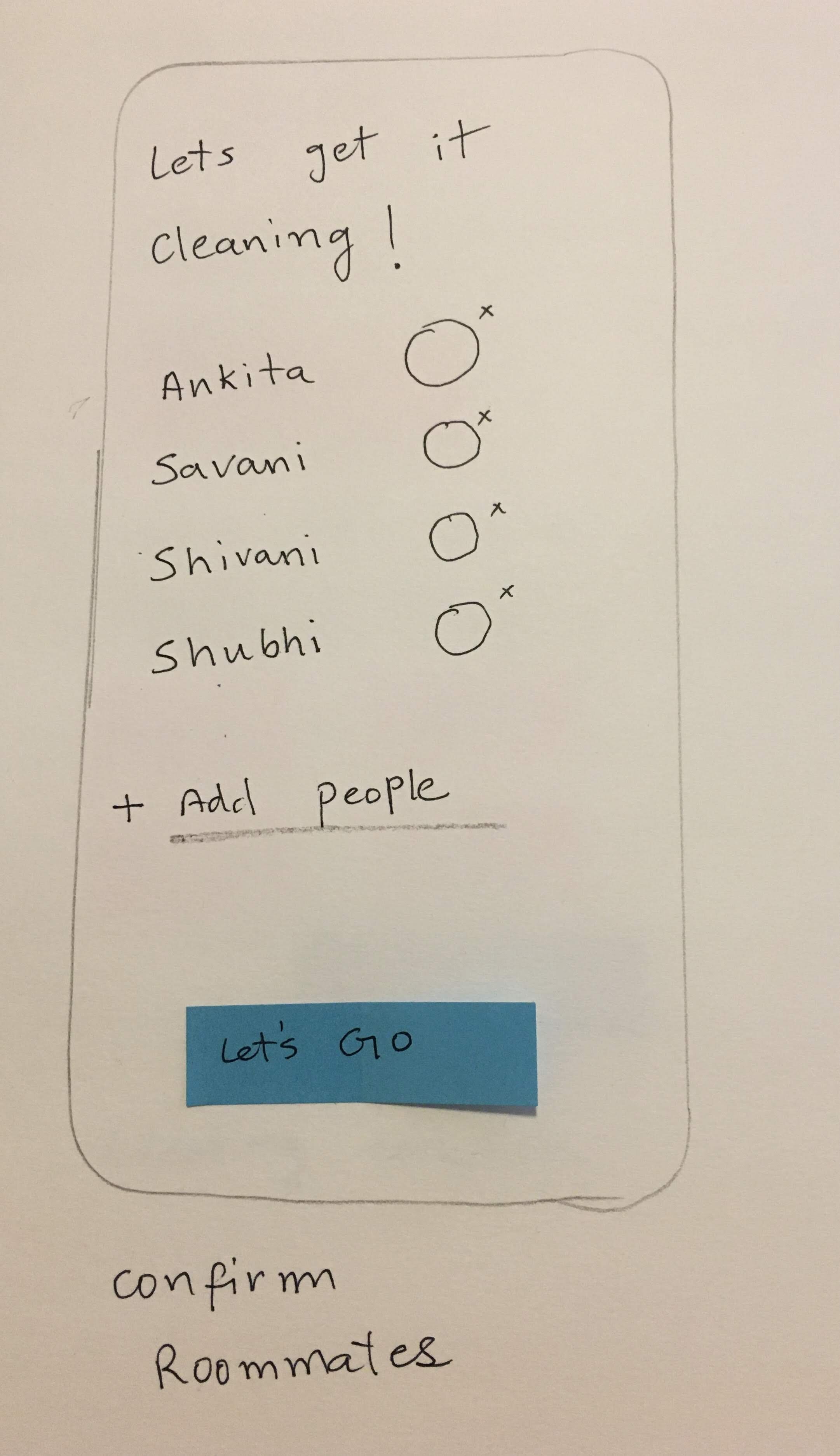
Confirm addition screen
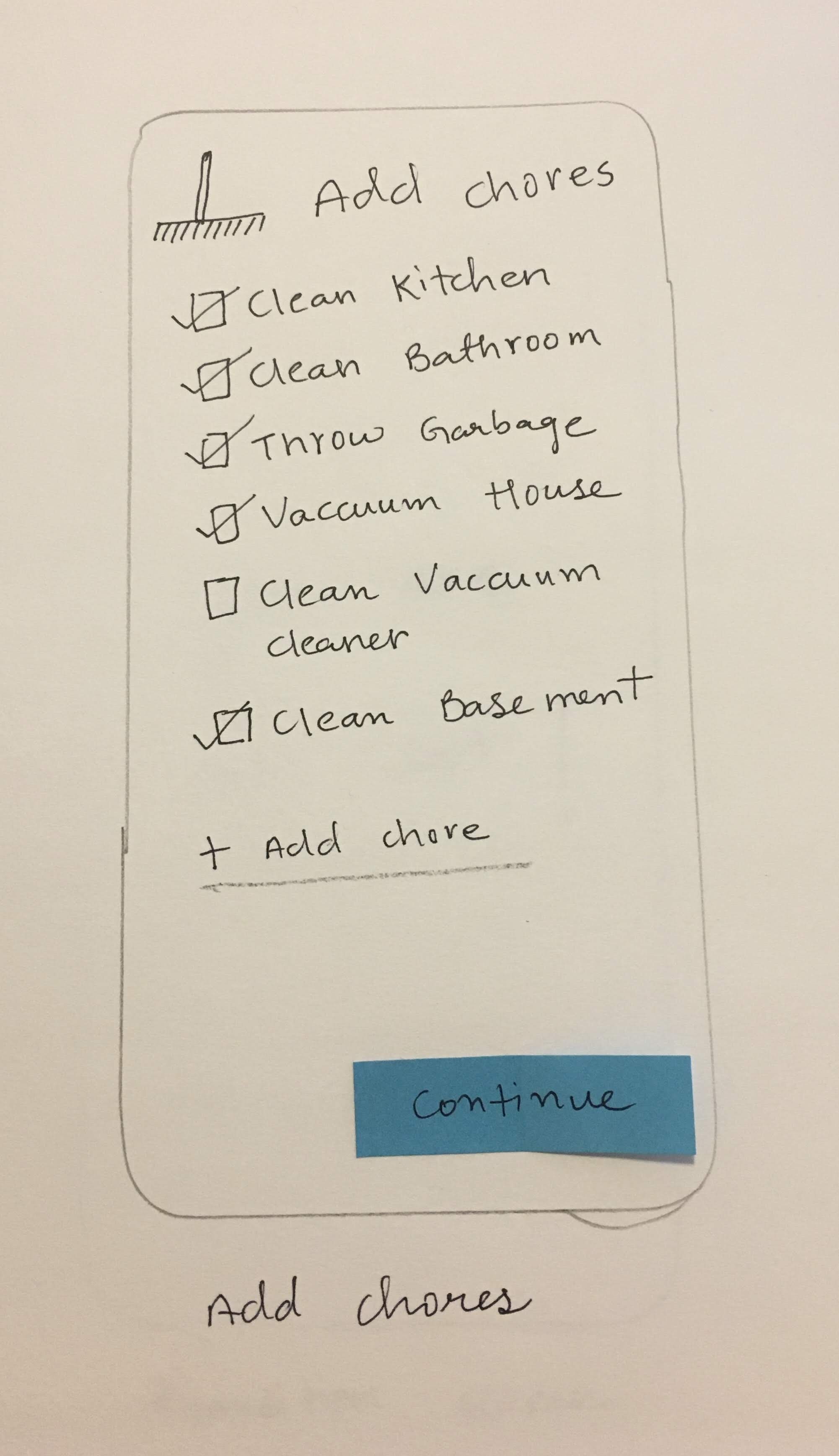
Add Chores
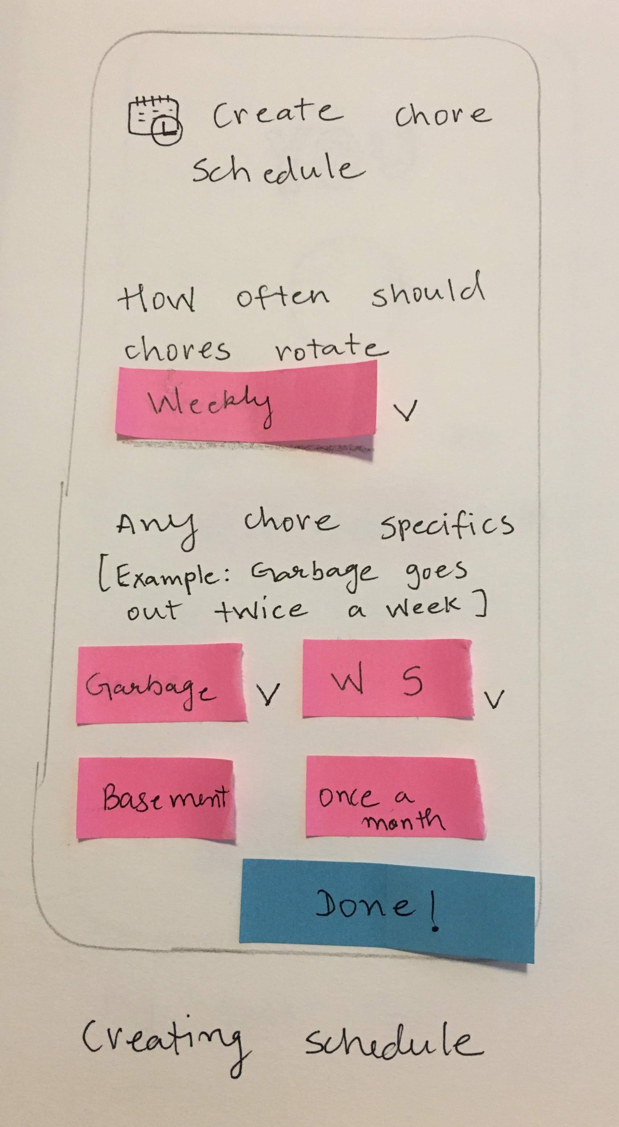
Schedule chores- 1
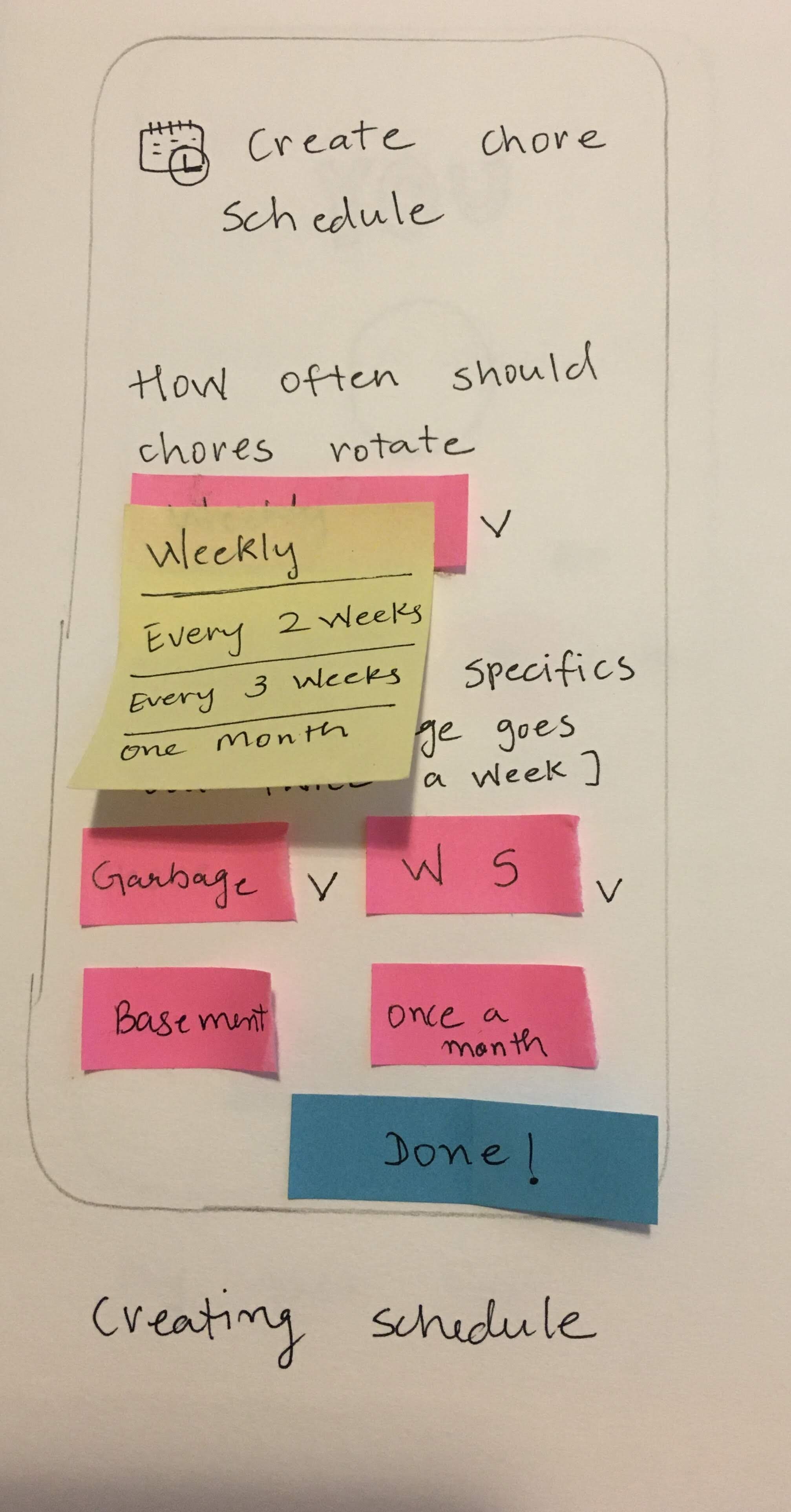
Schedule chore-2
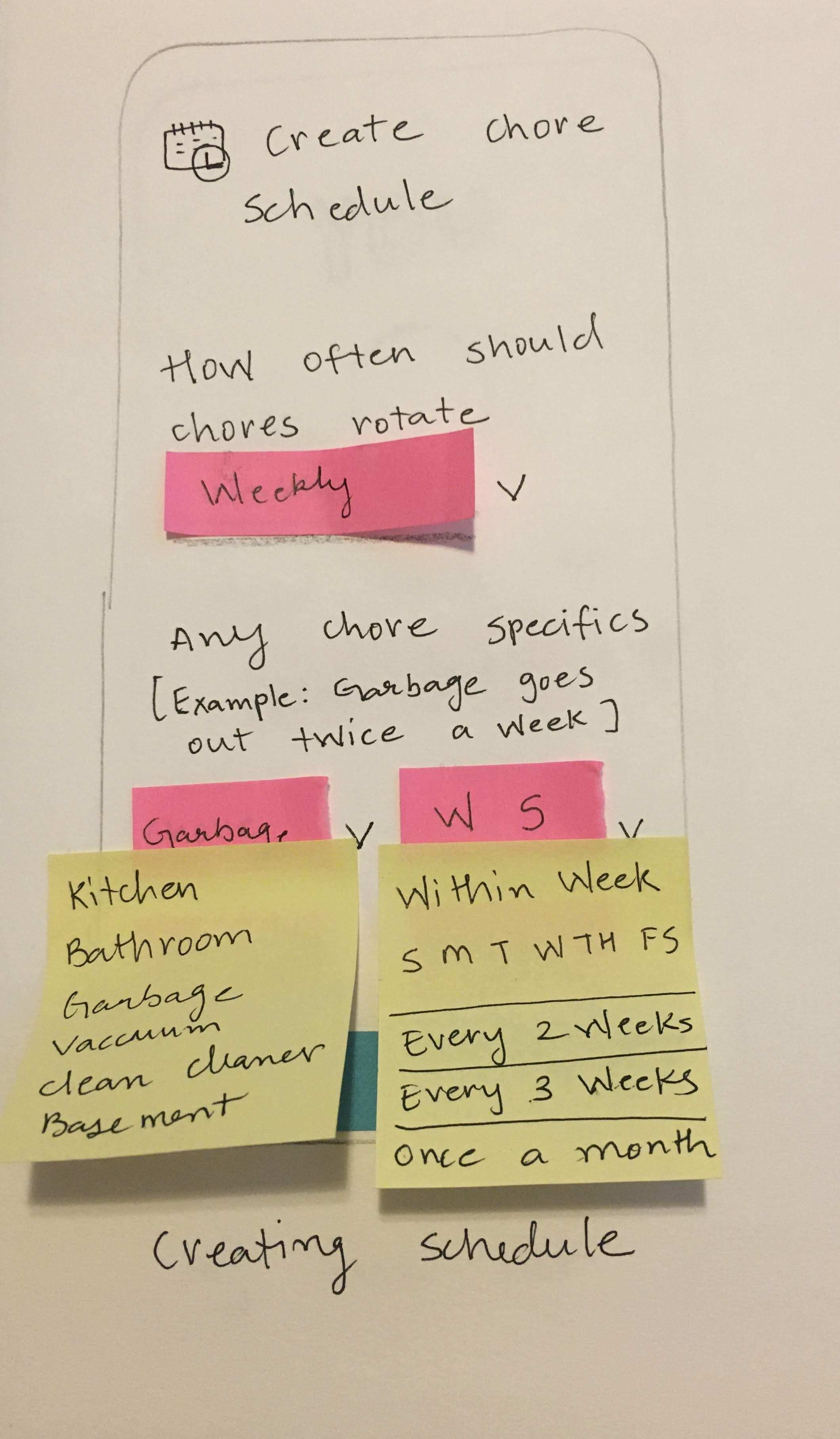
Schedule chore-3
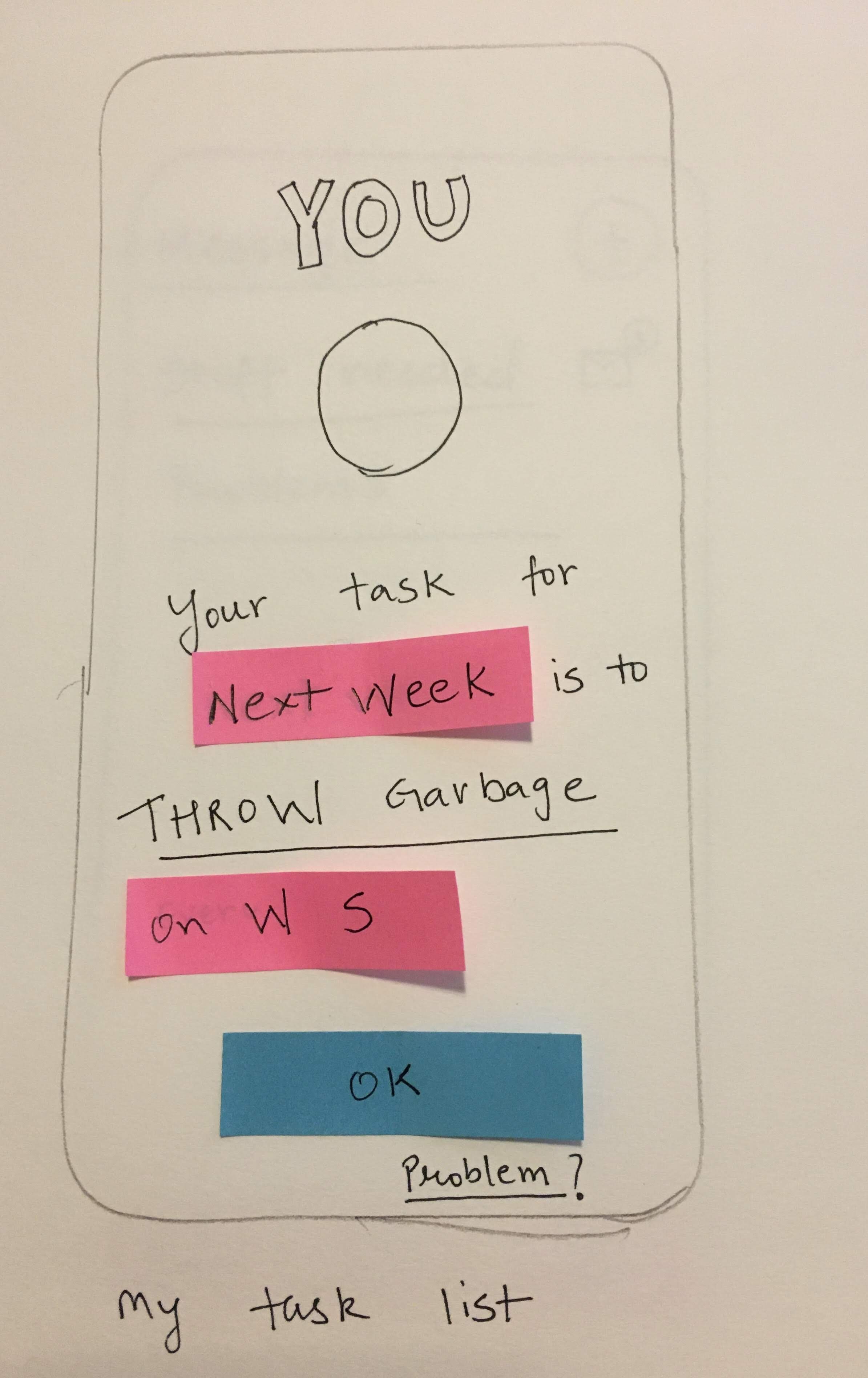
Profile
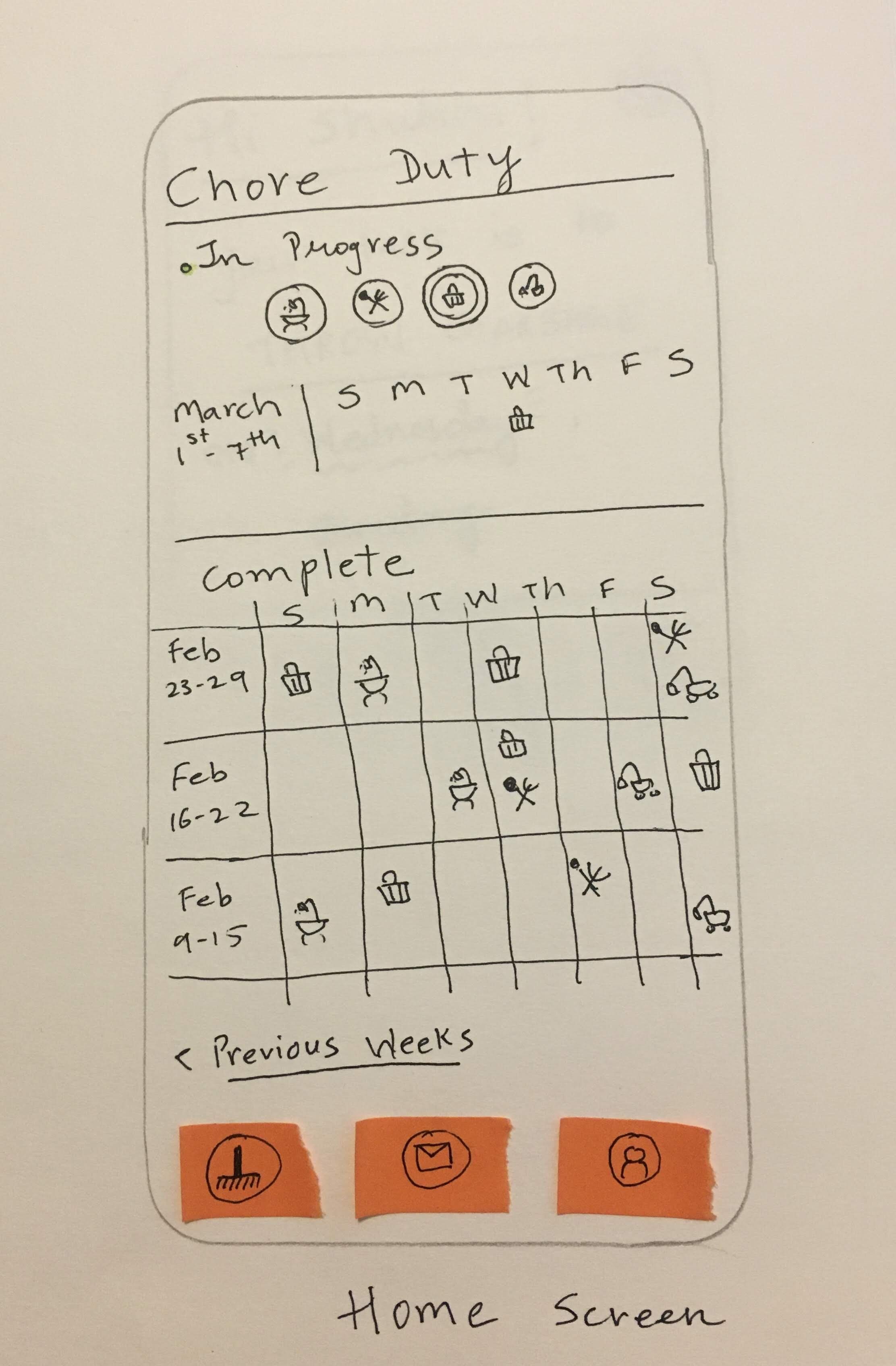
Home screen
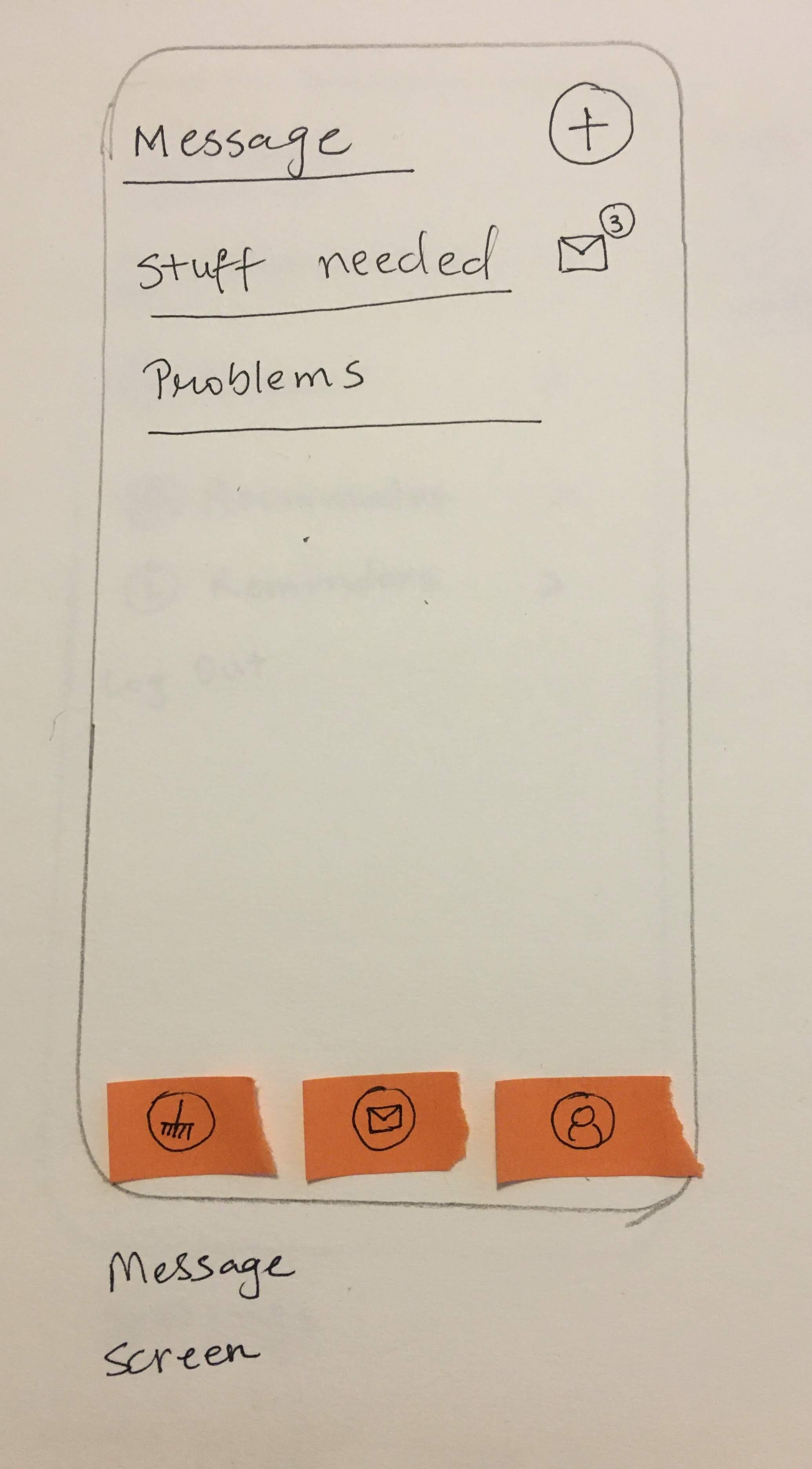
Message feature
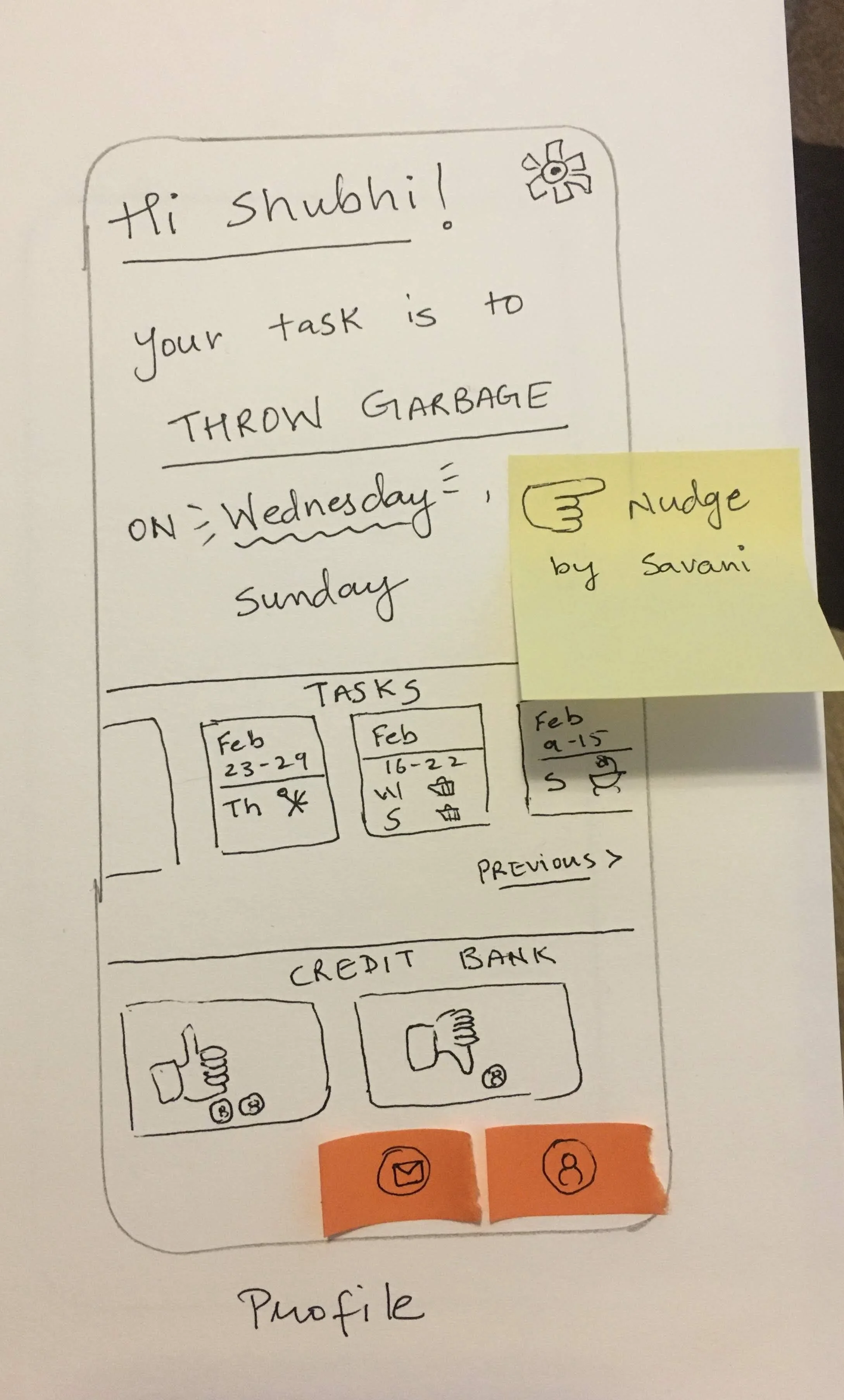
User's task list screen
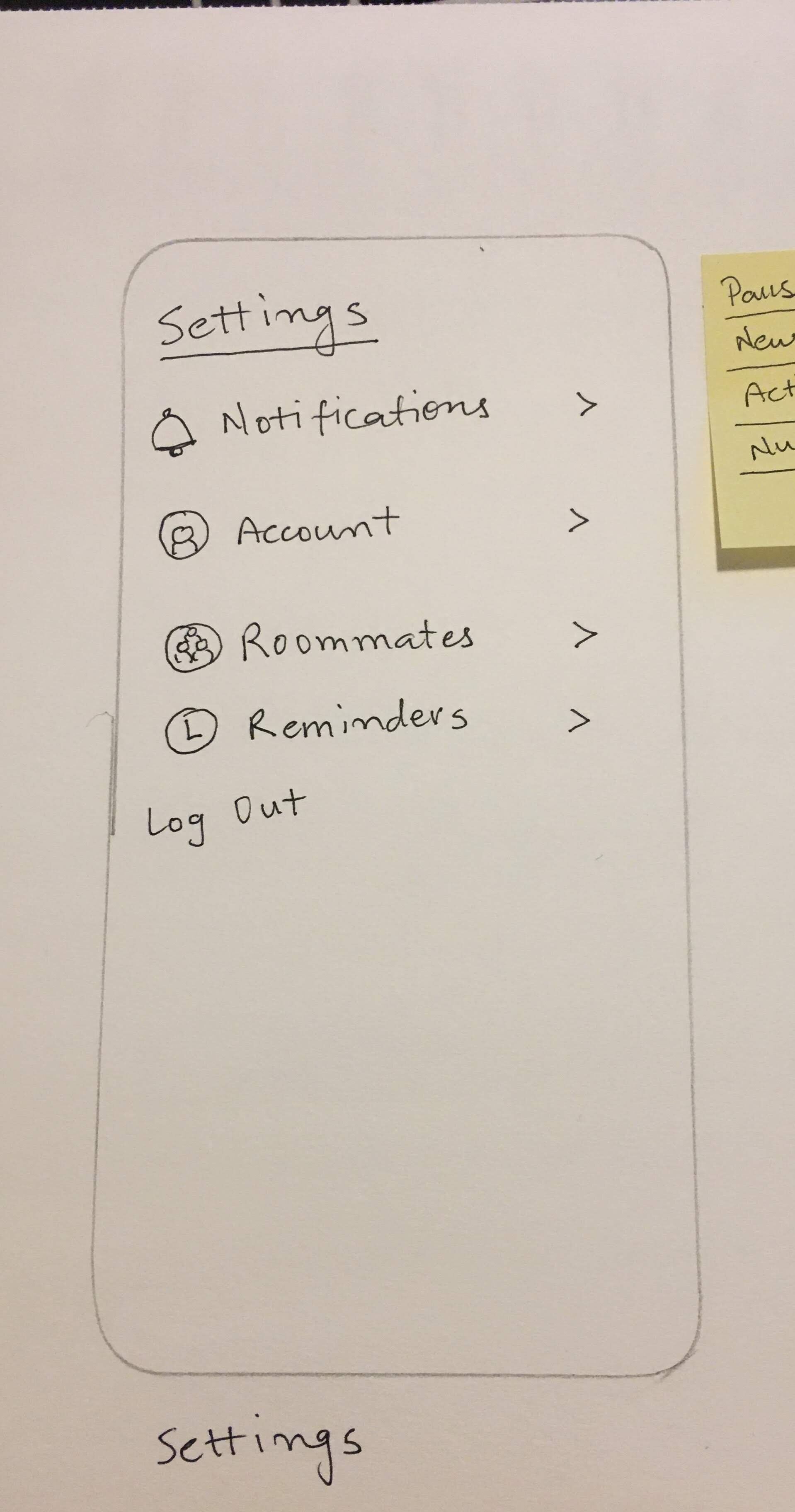
settings
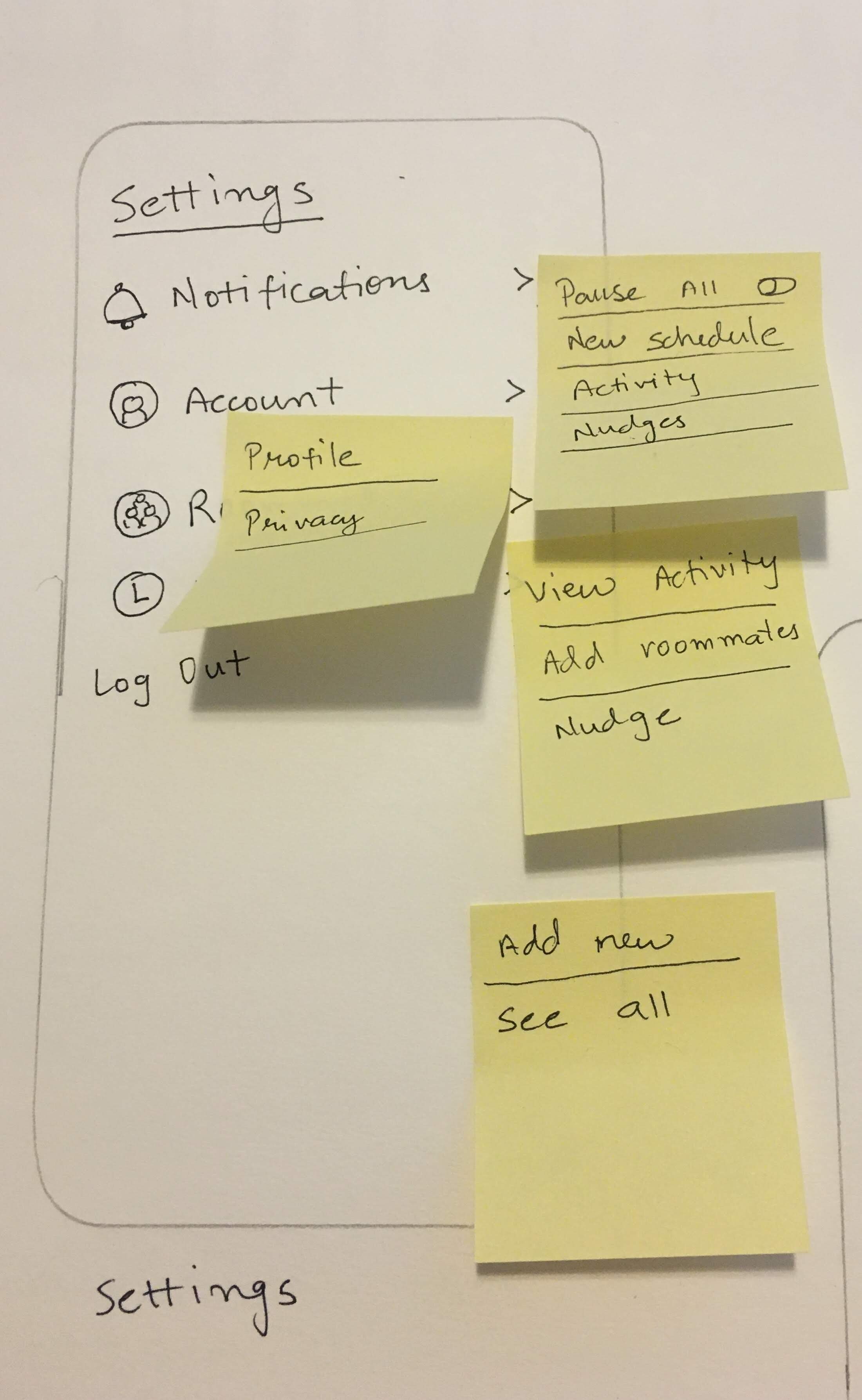
settings screen showing options
Since I wanted to keep the approach user-centric, I decided to seek feedback after every design iteration. I recruited 4 participants to provide feedback on initial wire frames.
Initial feedback
What confused them:
How to mark completed chores
Would messaging feature be useful?
Lengthy process to set timetable
Suggestions from participants:
Color code and name initials for people who don’t wish to display their profile picture
Add comment feature next to chores to facilitate easy communication
Badges for completing tasks on time
A monthly report showing missed chores, chores done on time and areas which are relatively dirty. (Example, if bathroom cleaning was missed twice, and kitchen was cleaned all 4 weeks, bathroom is relatively dirty.)
Medium Fidelity Prototypes
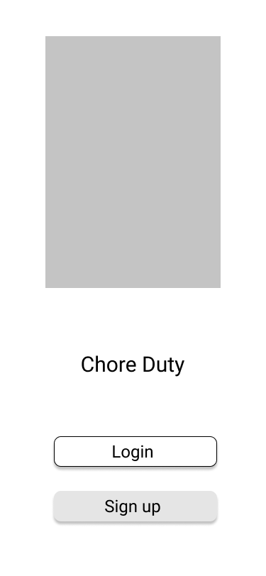
Splash screen
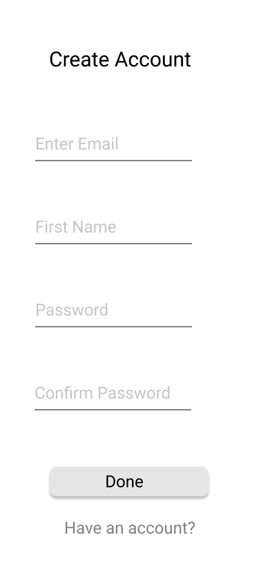
Sign up
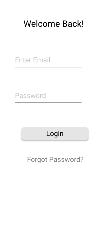
Login
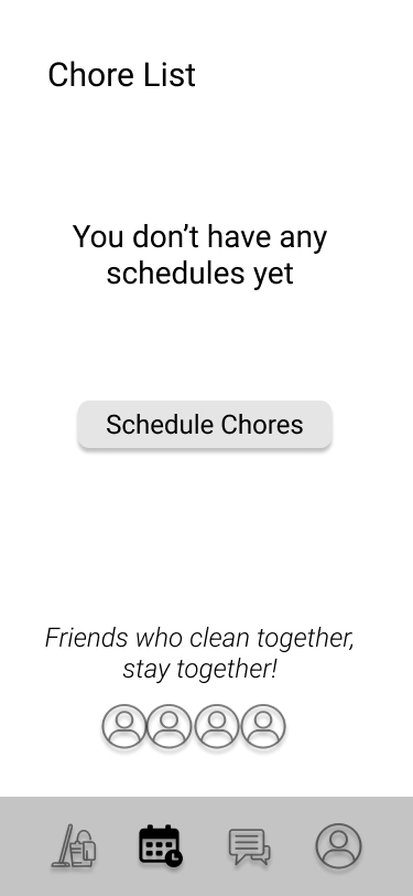
Scheduling chores
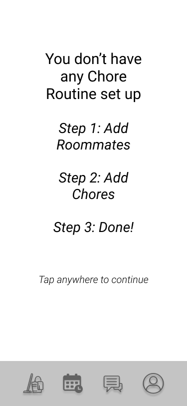
Scheduling steps
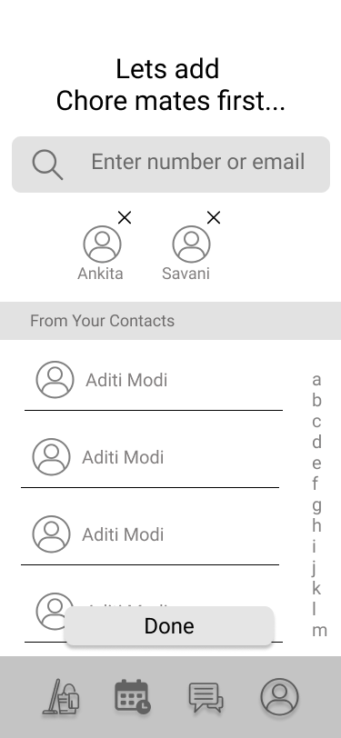
Adding roomates
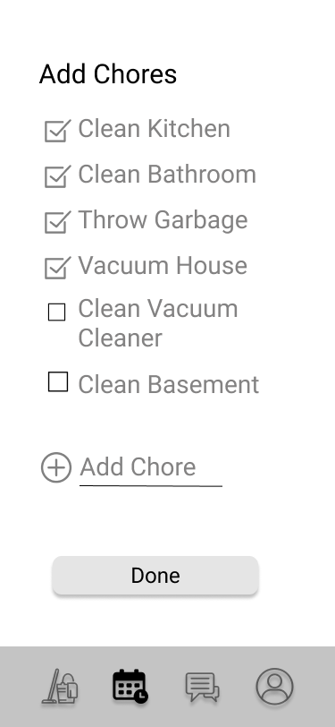
Adding chores
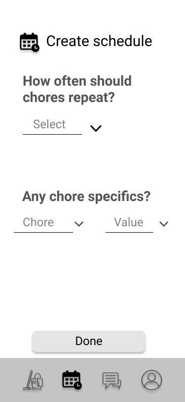
Creating schedule with chores and people added
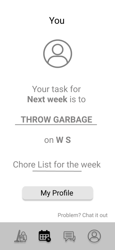
Users profile
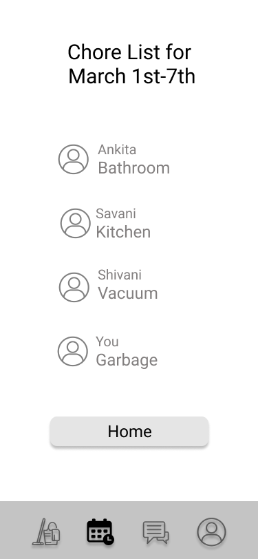
Chore list indicating chores and people assigned
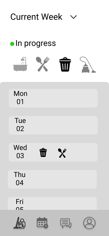
User's chore list
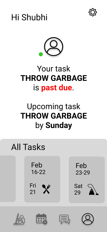
home screen
I went back to same participants, I had interviewed before, and feedback on this iteration was:
“Screens don’t look fascinating. They are rather dull" —Participant 1
“Home page seems cluttered” —Participant 2
“Some screens look repetitive. Chore list appears to be too many times” —Participant 2
Branding
This application revolves around the idea of task management, with an effort to work collaboratively. I thought of using the color Blue as my primary because according to color psychology in design blue represents clam and friendliness. I decided to use Roboto because it is easily readable and works best for content heavy projects. I used iOS 13 GUI design guidelines and played around with illustration packs from Icons8 Illustrations, Blush, UnDraw and Stubborn Library.
High Fidelity Prototype
I studied few task and project management applications as references to design the final screens (source: Dribbble, Behance). Overview of changes from mid fidelity to high fidelity:
Shortened the on-boarding experience
Followed thorough minimalist design approach
Improved visual design and information architecture
Home screen
Login/Signup Screens
App Setup
Main Screens
Interactions
Please visit here to play around with the prototype!
Sign-up process
Ticking off the tasks done.
System sends a notification once all the tasks completed.
Viewing schedules
I designed two viewing styles, list and calendar. List view shows all the schedules in one single screen and the corresponding month it is assigned to. There’s a green dot besides the current schedule that it’s in use. For the calendar view, I decided to highlight the days which are using the schedule selected by the user from the drop-down.
Log-in process
Since this design is for iOS, I integrated face id feature and gave user an option to login with Facebook. (My idea behind using Facebook was to allow user to add from FB)
Adding a schedule
Learnings
Hierarchies are tougher to handle than I thought!
Write the objective and problem statement on a piece paper and tally with designs to check if my requirements are matched
My initial challenge was to include as many details as possible but after testing the prototypes, minimalism was preferred. Sketching and a lot of back and forth with affinity mapping helped to prioritize
Improved my data mapping and visual design skills.
Questions to think and consider
To add gamification or not?
Integrate incentives by adding badges
Creative ways for task remainders
How would system work if someone doesn’t perform their chores for prolonged period of time, and in such case how would that affect the scheduling of chores.


